
Hello Chattanooga small business owners!
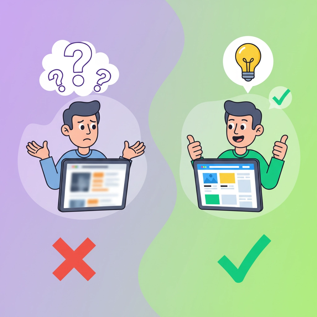
Your website is killing your sales RIGHT NOW – and you might not even know it.
Every single day, potential customers in Chattanooga are visiting your website, getting frustrated, and immediately leaving to buy from your competitors instead. The worst part? These are fixable problems that most local businesses are making without realizing the devastating impact on their bottom line.
After working with hundreds of Chattanooga small businesses, we've identified the five critical web design mistakes that are costing you thousands of dollars in lost revenue every single month. But here's the good news – you can fix every single one of these issues and start recovering those lost sales immediately!
Mistake #1: Your Navigation Menu Is a Confusing Maze
Here's what's happening RIGHT NOW on your website:
Your visitors land on your homepage, look for what they need, and within 8 seconds they're completely lost. Why? Because your navigation menu is either buried under fancy dropdown menus, labeled with industry jargon that only YOU understand, or so complicated that normal people can't figure out where to click!

This is costing you sales because: When someone can't find what they're looking for in those crucial first few seconds, they don't stick around to figure it out. They immediately bounce to your competitor who makes it obvious where to go next.
The 2026 Fix That WILL Increase Your Sales:
You must redesign your navigation with crystal-clear labels that a 12-year-old could understand. Stop using clever wordplay and industry terms! Instead of "Solutions," say "Services." Instead of "Resources," say "Free Guides."
Here's your action plan:
- Limit your main menu to 5-7 clear options maximum
- Put your most important pages (like "Contact Us" and "Get Quote") in the top right corner
- Test your navigation by asking someone outside your industry to find specific information on your site
Mistake #2: Your Website Looks Terrible on Mobile (And 73% of Chattanooga Shoppers Use Mobile!)
This one is HUGE – and if you're not fixing this immediately, you're literally throwing money away!
The brutal reality: Over 73% of your Chattanooga customers are viewing your website on their phones. If your site doesn't work perfectly on mobile, you've already lost nearly three-quarters of your potential sales before they even see what you offer.
What's probably wrong with your mobile site right now:
- Text is too small to read without zooming
- Buttons are too tiny to tap accurately
- Your contact information is buried or hard to find
- Images take forever to load (anything over 3 seconds = goodbye customer!)
- Forms are impossible to fill out on a phone
The 2026 Mobile Fix That Will Save Your Sales:
You WILL adopt a mobile-first approach – this is not a suggestion! Design everything for mobile screens first, then make it work on desktop.
Your immediate action steps:
- Test your website on your actual phone RIGHT NOW – can you easily read everything and tap all buttons?
- Make sure your phone number is clickable and appears at the top of every mobile page
- Optimize all images to load in under 2 seconds (use tools like TinyPNG)
- Ensure all buttons are at least 44 pixels wide for easy tapping
Mistake #3: Visitors Have No Clue What You Actually Do (The 5-Second Rule Failure)
Here's the test: Show your homepage to someone who doesn't know your business. Give them exactly 5 seconds to look at it, then ask them to explain what your company does and why someone would hire you.
If they can't give you a clear answer, your website is failing the most important test – and you're losing sales every single day because of it!
Why this destroys your sales: People have zero patience for figuring out what you do. If your value proposition isn't crystal clear within those first few seconds, they're gone forever.
The 2026 Value Proposition Fix:
You must create a headline that immediately tells visitors:
- What you do
- Who you do it for
- What specific problem you solve
Bad example: "Innovative solutions for modern businesses"
Good example: "We help Chattanooga restaurants increase takeout orders by 40% with professional food photography and social media marketing"
Your assignment: Rewrite your homepage headline using this formula: "We help [specific type of Chattanooga business] achieve [specific result] through [your specific service]."
Mistake #4: Your Website Looks Like It Was Designed in 2015 (And Nobody Trusts Outdated Businesses)
The harsh truth: Your website's visual design is the first impression potential customers have of your business. If it looks outdated, unprofessional, or inconsistent, people immediately assume your entire business is behind the times.
What's probably wrong with your design RIGHT NOW:
- You're using generic stock photos that scream "template website"
- Your fonts are too small, hard to read, or you're using 5 different fonts on one page
- Your color scheme looks like it was chosen randomly
- There's way too much text crammed into every section
- Your branding is inconsistent from page to page
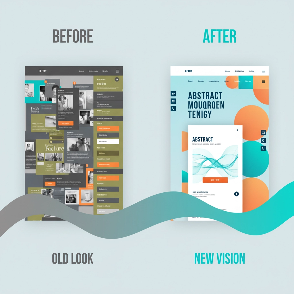
The 2026 Visual Design Fix That Builds Trust:
Step 1: Choose 2 fonts maximum – one for headlines, one for body text. Use at least 16px for mobile text (anything smaller is unreadable).
Step 2: Pick 3 brand colors and stick to them throughout your entire website. Use a tool like Coolors.co to ensure they work well together.
Step 3: Replace those generic stock photos with real photos of your actual team and work. Even smartphone photos of your real business are better than fake stock images.
Step 4: Add plenty of white space between sections. Crowded websites feel overwhelming and unprofessional.
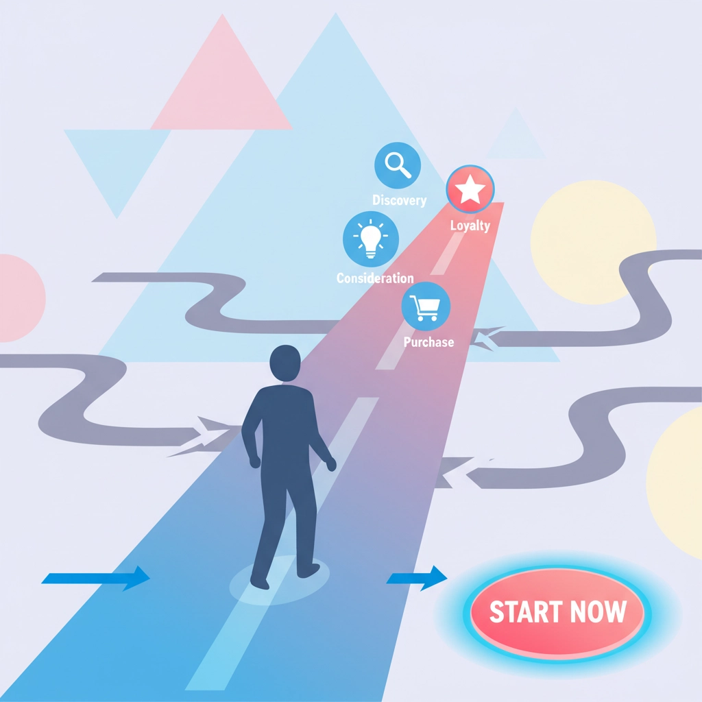
Mistake #5: You're Overwhelming Visitors Instead of Guiding Them to Buy
This is the #1 conversion killer: Your website is trying to say everything at once, and as a result, visitors don't know what action to take next. They're overwhelmed by too many choices, too much information, and no clear path forward.
What this looks like on your site:
- Every page has 5 different calls-to-action competing for attention
- You're trying to explain every single service on your homepage
- Your "Contact Us" button is tiny and buried at the bottom
- Visitors can't figure out the next logical step to work with you
The 2026 Conversion Fix That Will Transform Your Sales:
You WILL simplify every single page to focus on one primary action you want visitors to take.
For your homepage: The main goal should be to get people to either call you, fill out a contact form, or schedule a consultation. Everything else is secondary.
Your conversion action plan:
- Make your primary call-to-action button bright, bold, and impossible to miss
- Use action words like "Get Your Free Quote," "Schedule Your Consultation," or "Call Now for Same-Day Service"
- Place your main CTA button at least 3 times on every important page
- Remove competing offers and distracting links that lead people away from your main goal
Your 2026 Action Plan: Fix These Issues THIS WEEK!
Don't wait until next month – every day you delay these fixes is costing you real sales from real Chattanooga customers.
Week 1 Priority Fixes:
- Monday: Test your mobile experience and fix obvious issues
- Tuesday: Rewrite your homepage value proposition using our formula
- Wednesday: Simplify your navigation menu with clear labels
- Thursday: Create one bold, clear call-to-action for each important page
- Friday: Replace generic stock photos with real images of your business
Week 2 Priority Fixes:
- Optimize all images for faster loading
- Standardize your fonts and colors across all pages
- Add plenty of white space to reduce visual clutter
- Test your navigation with someone outside your industry
The bottom line: These aren't just "nice to have" improvements – these changes will directly impact your sales within 30 days. Chattanooga small businesses that fix these five critical mistakes typically see a 15-25% increase in leads and sales from their website.
Need help implementing these fixes? At Mediafy, we've helped hundreds of Chattanooga small businesses transform their websites from sales killers into revenue generators. Don't let another month of lost sales go by – these problems are fixable, and the sooner you address them, the sooner you'll start seeing more customers and higher profits.
The question isn't whether you can afford to fix these issues – it's whether you can afford NOT to fix them while your competitors are stealing your customers every single day.